- Understanding the Role of an Ecommerce Homepage
- Crafting Simple and Straightforward Navigation
- Enhancing Visual Appeal with High-Quality Images and Graphics
- Drawing Inspiration from Successful Ecommerce Homepage Examples
- Utilizing Strategic Call-to-Actions (CTAs)
- Ensuring Mobile Responsiveness for a Seamless Experience
- Simplifying Design with Minimalism
- Maintaining Consistent Branding
- Incorporating Interactive Elements to Engage Users
- Highlighting Products Strategically
- Optimizing Load Speed
- Creating a Seamless User Experience
- Building Trust with Trust Signals
- Conclusion
- FAQs
What will increase an entrepreneur’s chances of success when they open an internet store? Well, several factors. To stay in the forefront of prospects’ and customers’ minds, stay in touch with them by providing referral programs and following up frequently.
Offering a flawless customer experience to your consumers is crucial if you want to differentiate yourself from the competition in an increasingly crowded industry. We will discuss some of the most popular e-commerce best practices that store owners ought to implement in the paragraphs that follow.
- Understanding the Role of an Ecommerce Homepage
- Crafting Simple and Straightforward Navigation
- Enhancing Visual Appeal with High-Quality Images and Graphics
- Drawing Inspiration from Successful Ecommerce Homepage Examples
- Utilizing Strategic Call-to-Actions (CTAs)
- Ensuring Mobile Responsiveness for a Seamless Experience
- Simplifying Design with Minimalism
- Maintaining Consistent Branding
- Incorporating Interactive Elements to Engage Users
- Highlighting Products Strategically
- Optimizing Load Speed
- Creating a Seamless User Experience
- Building Trust with Trust Signals
- Conclusion
- FAQs
Understanding the Role of an Ecommerce Homepage
The ecommerce homepage is often likened to the digital storefront of your online business. Just as a physical storefront gives passersby a glimpse into what the store offers, your homepage provides potential customers with their first impression of your brand and its offerings. It’s often the first impression, which is critical since it may sway the visitor either to stay and learn more or leave and go somewhere else. With this high-stakes scenario, the role of the homepage goes far beyond being merely cosmetic in nature.
First Impressions Matter
When they land on your homepage, visitors to your site immediately start making an opinion on your brand—from design and layout to the content that appears. Attractive design, ease of use, and relevant information in a well-designed homepage can provoke further exploration by visitors, resulting in greater engagement and better sales, and higher customer loyalty. Otherwise, it can drive potential customers away if a homepage is cluttered, confusing, or too slow, thereby losing sales.
Guiding Visitors to Explore Further
Beyond making an impactful first impression on your customers, the most critical role of your ecommerce homepage is to engage them with your brand and drive them toward your product and category pages. That includes clearly defining the unique value proposition—what sets your brand apart—but also entails the showcasing of popular or newest products. Effective navigational aids should be available, like an organized menu and a very visible search bar. This can help in fast and easy location of products or information the user is looking for.
Building Trust and Credibility
Your homepage also plays a vital role in establishing trust and credibility with your visitors. In a marketplace where customers are often concerned about the security of their personal and payment information, displaying trust signals like customer reviews, feedback, and security badges can reassure visitors about the legitimacy and reliability of your business. A trustworthy homepage can lead to higher customer confidence, which is crucial for driving conversions and building a loyal customer base.
Crafting Simple and Straightforward Navigation
Navigation is the backbone of user experience on your ecommerce homepage. An ecommerce website with poor navigation will frustrate customers and result in early abandonment of your website during the shopping experience. To this effect, ensure that the navigation system on your homepage is good, well-structured, and intuitive to assure every visitor that they can find whatever they want with the least amount of hassle. Smooth navigation not only keeps users around for a longer period but also maximizes the possibility of converting them into paying customers.
Structuring the Navigation Menu
A well-structured navigation menu is essential for guiding visitors through your site. It should categorize your products or services clearly, with logical groupings that make sense to your users. For example, if you sell clothing, your navigation might include categories like “Men,” “Women,” “Kids,” and “Accessories,” each with subcategories that drill down into specific product types. This structure allows users to easily browse through different sections without feeling overwhelmed by too many options.
Maintaining Consistency Across Pages
Navigation must be consistent. Your menu should appear on every page of your site and should be precisely the same so that people always know where they are, as well as how to get anywhere else. This consistency will not only enhance the user experience, but it also reinforces this image of your brand as a professional and reliable one. No matter where they may be, they should be able to go straight back to your homepage or any other significant part of your site in a single click.
Enhancing Search Functionality
Together with a well-structured menu, a visible and functional search bar is an equally important constituent of your homepage navigation. This is very helpful to those users who know precisely what they are looking for and would like to find it right away. Position the search bar at the top of the page, where it cannot be missed, and make sure that it delivers relevant and accurate results. Advanced filters and autosuggestions in the search option make it easier for visitors to search for products.
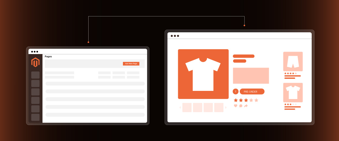
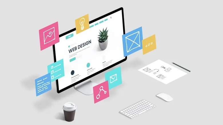
Enhancing Visual Appeal with High-Quality Images and Graphics
It’s visual content that can keep visitors on the page. Good visuals, in a digital world where attention spans are awfully short, can make all the difference between a visitor sticking around or leaving. Proper visuals will do much more than just attract attention; they reveal value for a product and, therefore, assist prospective buyers in making proper purchasing decisions.
The Power of Professional-Grade Images
High-quality images are essential for showcasing your products effectively. While in a physical store, customers can see and touch your products; an online customer sees mainly only images of your products before making a purchase decision. Professional-grade images will show your product from all sides so that the customer can get a full view of what they are buying. They should be clear, well-lit, and true to color—to give customers an accurate feel for the product.
Complementing Visuals with Compelling Copy
While images capture attention, it’s the accompanying copy that convinces customers to make a purchase. Every image on your homepage should be complemented by concise and compelling copy that highlights the key benefits and features of your products. This copy should be straightforward and to the point, focusing on what sets your products apart from the competition and why customers should choose your brand.
Using Banners and Hero Images Effectively
Hero images and banners refer to bigger visuals; they can be used to pass across larger messages or for the promotion of special products or offers. These elements are usually found at the top of the homepage, giving visitors a shock to their senses: they are the first elements your site’s visitor will see. With good design, a banner or hero image can instantly communicate to your brand’s key messages for that particular time, for example, a seasonal sale, a new product launch, or a special offer. These visuals need to be arresting and on point with your brand, such that the overall experience is coherent and gripping enough to capture and compel visitors to check your site deeper.
Drawing Inspiration from Successful Ecommerce Homepage Examples
Analyzing successful ecommerce homepages can provide valuable insights and inspiration for your own site. By examining what works well for industry leaders, you can implement similar strategies to improve your homepage’s effectiveness.
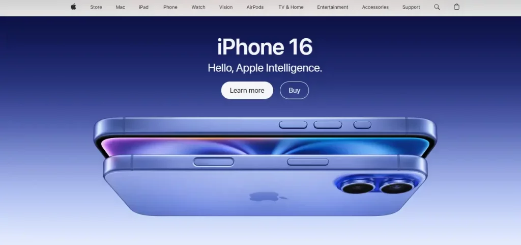
Apple: Minimalism and High-Quality Visuals
Apple’s ecommerce homepage is a prime example of minimalist design done right. The page features a clean and simple layout with a focus on high-quality visuals that showcase their products. Apple effectively uses whitespace to draw attention to featured products, and their CTAs are clear and strategically placed. The navigation is straightforward, making it easy for users to find what they’re looking for. Apple’s homepage is a lesson in how simplicity and elegance can create a powerful user experience.
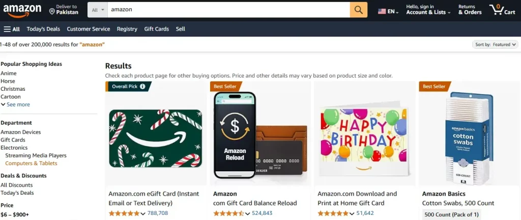
Amazon: Personalization and Recommendations
Amazon excels in personalization and product recommendations. The homepage leverages user data to display products that are most relevant to each visitor, creating a tailored shopping experience. Deals and promotions are prominently featured, encouraging users to explore and make purchases. Amazon’s use of personalized recommendations not only enhances the user experience but also drives higher conversions by showing visitors items they are likely to be interested in.
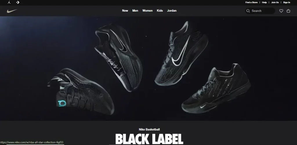
Nike: Consistent Branding and Dynamic Content
Nike’s ecommerce homepage is a great example of consistent branding. The design reflects Nike’s identity through bold visuals, dynamic content, and a cohesive color scheme. The homepage highlights new releases, collections, and athlete endorsements, reinforcing the brand’s image and engaging users. Nike’s use of high-quality imagery and interactive elements helps create an immersive shopping experience that resonates with their target audience.
Utilizing Strategic Call-to-Actions (CTAs)
Call-to-actions (CTAs) are vital for guiding visitors toward specific actions that align with your business goals. Be it buying a product, subscribing to a newsletter, or even studying new products, CTAs are the triggers that get users to perform their next action in the customer journey. Even the most perfectly designed homepages are rendered fruitless in converting visitors to customers if not accompanied by an effective call-to-action.
Designing Effective CTAs
CTAs should be prominently placed and designed to be easily noticeable. Your CTA design should really make them pop against the rest of the page with contrasting, bright colors that call for attention but are not overwhelming. Text used within CTAs is an action-oriented way to clearly let people know why they need to click. Something like “Shop Now,” “Learn More,” or “Sign Up” is concise, direct, and lets the user know exactly what they need to do next.
Strategic Placement of CTAs
The placement of CTAs is just as important as their design. CTAs should be strategically located where users are most likely to engage with them, such as near product descriptions, within promotional banners, or at the end of informational sections. However, it’s important not to clutter the homepage with too many CTAs, as this can overwhelm visitors and dilute the effectiveness of each one. Focus on a few key actions that align with your business goals and position your CTAs accordingly.
Enhancing CTAs with Personalization
Personalization can also enhance the effectiveness of CTAs. Tailor the messaging based on user behavior and preferences, such as showing returning visitors a CTA encouraging them to check out new arrivals or prompting first-time visitors to explore popular categories. A/B testing is a valuable tool for optimizing CTAs. Experiment with different designs, placements, and wording to see what resonates best with your audience. Continuously monitor performance and make data-driven adjustments to maximize the impact of your CTAs.
Ensuring Mobile Responsiveness for a Seamless Experience
As mobile devices become increasingly prevalent, ensuring that your ecommerce homepage is mobile-responsive is no longer optional—it’s essential. With a significant portion of online shopping now taking place on smartphones and tablets, a mobile-responsive design ensures that your site provides a consistent and user-friendly experience across all devices. A mobile-friendly homepage is not just about resizing content; it’s about optimizing the entire user experience for smaller screens.
Adapting Design Elements for Mobile
To achieve mobile responsiveness, your homepage design should be fluid, with flexible images and layouts that automatically adjust to fit the screen size of any device. This means ensuring that text remains legible, images scale appropriately, and navigation elements are easy to tap. A mobile-responsive site should also eliminate any elements that don’t translate well to smaller screens, such as overly complex menus or large blocks of text.
Streamlining Mobile Navigation
Navigation on mobile devices should be simplified to enhance usability. Drop-down menus, for example, can be collapsed to save space and only expand when needed. CTAs should remain prominent and be large enough to be easily clickable on a touch screen. Ensuring that users can navigate your site with one hand on a smartphone is crucial for providing a seamless mobile experience.
The Impact on Load Speed and SEO
Beyond just appearance, mobile responsiveness also affects your site’s load speed and user experience. A responsive site typically loads faster, which can reduce bounce rates and increase conversions. Additionally, search engines like Google consider mobile responsiveness as a ranking factor, meaning that optimizing your site for mobile can also boost its visibility in search results. In a competitive market, every advantage counts, and mobile responsiveness is a key factor in maintaining a competitive edge.
Simplifying Design with Minimalism
In the world of ecommerce, less is often more. A minimalist design approach focuses on simplicity, ensuring that the most important elements stand out while unnecessary distractions are minimized. A well-executed minimalist design not only enhances the aesthetic appeal of your homepage but also improves functionality by making it easier for visitors to find what they’re looking for.
The Benefits of a Clutter-Free Homepage
A clutter-free homepage allows users to focus on the essential components, such as your products, value propositions, and CTAs. By reducing visual noise, you can guide users toward the most important actions, such as making a purchase or signing up for a newsletter. This can be achieved by prioritizing key information and using white space effectively to create a balanced and clean design that directs attention where it’s needed most.
Prioritizing Content with Minimalism
Minimalism also extends to the content you present to your users. Avoid overwhelming them with too many options or too much information. Instead, focus on the most important messages and present them in a clear and concise manner. This could mean highlighting your best-selling products, showcasing a limited-time offer, or communicating your brand’s core values in a straightforward way. By stripping away unnecessary elements, you create a more focused and impactful user experience.
Enhancing User Experience Through Simplicity
A minimalist design doesn’t just look good; it enhances the user experience by reducing cognitive load. When visitors are presented with fewer choices and clearer pathways, they are more likely to take action. This simplicity can lead to higher engagement and conversion rates, as users are not distracted or overwhelmed by too many competing elements on the page.
Maintaining Consistent Branding
Consistent branding across your ecommerce homepage is crucial for building recognition and trust among your visitors. In a digital landscape where customers have endless options, strong and consistent branding helps your business stand out and fosters a sense of reliability and professionalism.
Reflecting Your Brand’s Identity
Your homepage should reflect your brand’s identity through the consistent use of colors, fonts, and imagery. Every element on the page, from the logo to the typography, should align with your brand’s overall aesthetic and messaging. This consistency helps to reinforce your brand’s identity and makes your site instantly recognizable to returning visitors.
Building Trust Through Consistency
Consistency in branding also plays a key role in building trust with your audience. When visitors see a cohesive look and feel across your homepage and other pages of your site, it creates a sense of stability and professionalism. This can be especially important for new visitors who may be unfamiliar with your brand; consistent branding can reassure them that they are dealing with a reputable business.
Enhancing User Experience with Branding
Consistent branding enhances the user experience by creating a cohesive journey from start to finish. As users navigate through your site, they should encounter a seamless experience that reinforces your brand’s message at every turn. This not only makes your site more visually appealing but also helps to establish a stronger connection with your audience, leading to increased brand loyalty and repeat business.
Incorporating Interactive Elements to Engage Users
Interactive elements can make your ecommerce homepage more dynamic and engaging, encouraging visitors to explore your site further. In a world where attention spans are short, adding interactive features can help you capture and maintain the interest of your audience, leading to longer site visits and higher conversion rates.
The Role of Product Carousels and Banners
Product carousels and interactive banners are effective tools for showcasing a variety of products or promotions within a limited space. These features allow you to highlight multiple offerings without overwhelming the user with too much information at once. For example, a carousel can rotate through your top-selling products, while an interactive banner might showcase a special promotion or limited-time offer. These elements not only draw attention but also encourage users to interact with your content, increasing their engagement with your site.
Balancing Interactivity and Performance
While interactive elements can enhance user engagement, it’s important to use them sparingly to avoid slowing down your site’s loading speed. A site that takes too long to load can frustrate users and lead to higher bounce rates. Focus on interactive features that add value to the user experience, such as allowing users to rotate a product image, zoom in on details, or view a video demonstration of a product in use. These features should be implemented in a way that enhances the overall functionality of the site without compromising performance.
Enhancing User Engagement Through Interactivity
Interactive elements go beyond mere visual appeal—they actively engage users, making their browsing experience more enjoyable and personalized. For example, features like live chat, customer reviews that users can scroll through, or quizzes that help guide product selection can make the user feel more involved and catered to. When visitors are engaged, they are more likely to spend more time on your site, explore different products, and ultimately make a purchase. This level of interaction not only improves user satisfaction but also helps build a stronger connection between the customer and your brand.
Highlighting Products Strategically
Effectively showcasing your products on the homepage is essential for driving sales and conversions. The way products are presented can significantly influence a visitor’s decision to explore further or make a purchase. Strategic product placement on your homepage can highlight your best offerings and guide visitors toward items that meet their needs or pique their interest.
Featuring Top-Selling or New Arrivals
One of the most effective ways to draw attention to your products is by featuring top-selling items or new arrivals prominently on the homepage. These products should be showcased with high-quality images and concise descriptions that highlight their unique features and benefits. By placing these items front and center, you can immediately capture the interest of visitors who are looking for popular or trending products.
Implementing Personalized Recommendations
Personalized product recommendations can significantly enhance the user experience by showing visitors items that are most likely to interest them based on their browsing behavior and purchase history. By leveraging data from previous interactions, you can display products that align with the preferences and needs of individual users. This personalized approach not only increases the likelihood of conversion but also helps build a more personalized shopping experience, making customers feel valued and understood.
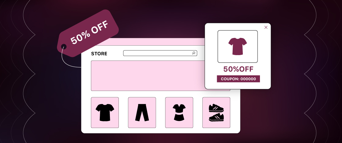
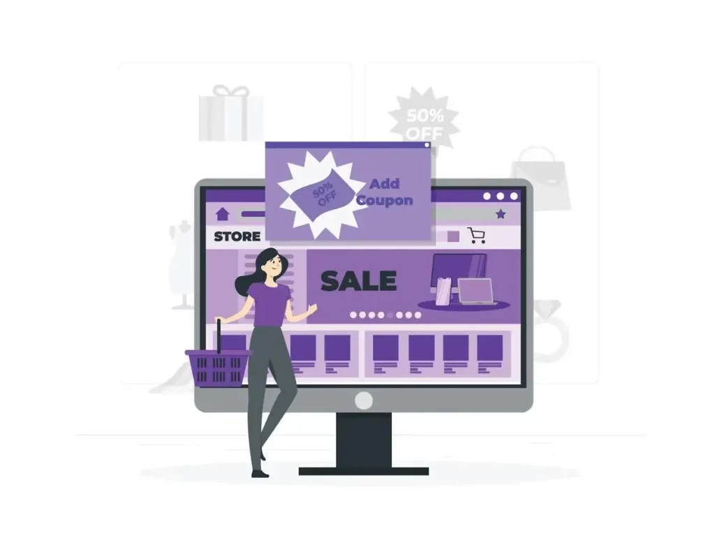
Highlighting Seasonal or Promotional Items
Another strategy is to feature seasonal or promotional items that create a sense of urgency. Limited-time offers, exclusive deals, or holiday specials can be highlighted on the homepage to encourage immediate action. Eye-catching banners, countdown timers, and promotional messages can be used to emphasize these offers, driving higher engagement and conversions.
Optimizing Load Speed
Load speed is a critical factor that can make or break the success of your ecommerce homepage. In today’s fast-paced digital environment, users expect websites to load quickly; even a slight delay can result in higher bounce rates and lost sales. Optimizing your homepage for fast load times not only improves user experience but also positively impacts your search engine rankings.
The Importance of Fast Load Times
A fast-loading homepage keeps users engaged and reduces the likelihood that they will abandon your site in favor of a competitor’s. Studies have shown that even a one-second delay in page load time can lead to a significant drop in conversion rates. As a result, optimizing load speed should be a top priority for any ecommerce business.
Techniques for Improving Load Speed
- Image Optimization: One of the most effective ways to reduce load times is through image optimization. Use compressed images that maintain quality but reduce file size. Additionally, implement lazy loading, which defers the loading of off-screen images until the user scrolls down to them, thereby speeding up the initial page load.
- Minimizing HTTP Requests: Each element on your homepage, such as images, scripts, and stylesheets, requires a separate HTTP request. Reducing the number of these requests can significantly improve load speed. Combine files where possible and remove any unnecessary elements to streamline your site.
- Utilizing Performance Tools: Tools like Google PageSpeed Insights, GTmetrix, and Pingdom can provide detailed reports on your site’s performance. These tools highlight areas that need improvement, such as image optimization, browser caching, and minifying CSS and JavaScript files.
Regularly Monitoring and Testing Load Speed
Load speed optimization is not a one-time task; it requires regular monitoring and testing. Use the performance tools mentioned above to regularly assess your site’s load speed and make adjustments as needed. As new content and features are added to your site, continuously test how they impact load speed and make optimizations to ensure your homepage remains fast and efficient.
Creating a Seamless User Experience
A seamless user experience is essential for keeping visitors engaged and encouraging them to explore your site further. When users can easily navigate your site, find what they’re looking for, and enjoy a smooth shopping experience, they are more likely to convert and return in the future.
Personalization:
Personalization is key to creating a seamless user experience. By tailoring the content and recommendations on your homepage to match individual user interests, you can create a more engaging and relevant shopping experience. Use data from user behavior and preferences to suggest products, content, or offers that are most relevant to each visitor. This personalized approach can lead to higher engagement, as users feel that the site is catering specifically to their needs.
Ensuring an Intuitive User Interface (UI)
The user interface (UI) should be intuitive and easy to navigate. All elements on your homepage should be easily accessible, and users should be able to find what they are looking for without confusion. This includes clear labels for navigation menus, a prominent search bar, and straightforward pathways to key pages like product categories, special offers, and customer support. A well-designed UI reduces friction and enhances the overall user experience, making it easier for visitors to complete their shopping journey.
Providing Multiple Contact and Support Options
In addition to a seamless UI, providing multiple ways for users to contact you or get support is crucial for enhancing the user experience. Include a live chat feature, customer support hotline, and an easy-to-find contact form. Quick and responsive customer support can make a significant difference in how users perceive your brand and their willingness to make a purchase. When users know they can easily reach out for help, they are more likely to feel confident in their decision to shop with you.
Building Trust with Trust Signals
Trust signals are essential for building credibility and reassuring visitors about the legitimacy of your ecommerce site. In an online environment where customers are often cautious about sharing personal and payment information, trust signals can make the difference between a visitor making a purchase or leaving your site.
Displaying Customer Reviews and Testimonials
Customer reviews and testimonials are some of the most powerful trust signals you can display on your homepage. Positive feedback from previous customers can instill confidence in potential buyers, especially when accompanied by star ratings and detailed reviews. Including customer photos can add authenticity and make the testimonials more relatable. Highlighting satisfied customer experiences helps create a sense of community and reliability, encouraging new visitors to trust your brand.
Showcasing Security Badges and Seals
Displaying logos from recognized security providers, such as SSL certificates, is another effective way to build trust with your audience. These badges reassure visitors that their personal and payment information is secure, which is especially important for first-time customers who may be unfamiliar with your brand. Additionally, badges from industry associations or certifications can further enhance your site’s credibility, signaling that your business adheres to high standards of security and professionalism.
Highlighting Media Mentions and Awards
If your brand has been featured in reputable publications or received industry accolades, showcasing these achievements on your homepage can significantly boost your credibility. Media mentions and awards demonstrate that your business is recognized and respected within your industry, providing additional reassurance to visitors. This not only boosts your credibility but also helps differentiate your brand from competitors who may not have received similar recognition.
Providing Clear Return and Refund Policies
Another important trust signal is a clear and transparent return and refund policy. Visitors want to know that they can shop with confidence, knowing they have the option to return products if they are not satisfied. By prominently displaying your return policy on your homepage, you can alleviate any concerns visitors may have about making a purchase. Transparency in policies and practices fosters trust and encourages repeat business, as customers feel secure in their decision to buy from your site.
Conclusion
A well-designed ecommerce homepage is crucial for attracting and converting visitors. By understanding the role of your homepage and incorporating key elements such as clear navigation, high-quality visuals, and effective CTAs, you can create a compelling user experience. Adhering to best practices, highlighting products strategically, and optimizing load speed are essential for maximizing engagement and sales. Trust signals, personalization, and regular updates further enhance the effectiveness of your homepage.
Implementing these ecommerce homepage design best practices will help you create a seamless and trustworthy shopping experience for your customers. Remember to continuously monitor and optimize your homepage based on user behavior and feedback. By staying proactive and adaptable, you can ensure that your ecommerce website homepage design remains competitive and successful in the ever-evolving digital landscape.
FAQs
What three things are required for eCommerce?
For eCommerce, you need a user-friendly online presence, a secure payment gateway, and a logistics and fulfillment system. In other words, you need a way for customers to explore and purchase products online, a way to process payments securely, and a way to have the products delivered to them.
What are some best practices for maintaining an eCommerce website effectively?
Regular backups, software updates, security patches, website speed optimization, mobile-friendly design, easy navigation, high-quality product images, user experience improvements, analytics tracking, and SEO optimization should all be given top priority when maintaining a website for eCommerce to guarantee an effortless purchasing procedure and draw in clients.
What is the role of the homepage?
The most crucial page on your website is the homepage. It plays a significant part in how people interact with your website and is frequently the page that both new and returning users view the most. Yet, deciding its content can be challenging. It’s simple to overburden yourself with information, copy content from other pages, and fail to consider the demands of your target audience.

Related Tutorials