Ecommerce Checkout Page Design Best Practices For Your Business
- Importance of Checkout Page Design
- Objectives of the Guidelines
- Simplify the Checkout Process
- Minimize the Number of Steps
- Maintain Transparency
- Enhance Usability and Accessibility
- Build Trust with Security Features
- Optimize Load Times and Performance
- Implement Effective Call-to-Action (CTA) Buttons
- Personalization and Customization
- Monitor and Analyze Checkout Performance
- Provide Support and Assistance
- Conclusion
- FAQs
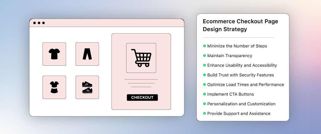
The e-commerce checkout page is an important phase in the customer journey. It’s the point at which potential customers decide whether to complete their order or abandon their shopping cart, thus it’s an important area for improvement. This page’s design substantially impacts sales conversions and overall user experience, making it an essential component of any e-commerce website. A well-designed checkout page not only guarantees a smooth transaction, but it also boosts client trust and happiness.
- Importance of Checkout Page Design
- Objectives of the Guidelines
- Simplify the Checkout Process
- Minimize the Number of Steps
- Maintain Transparency
- Enhance Usability and Accessibility
- Build Trust with Security Features
- Optimize Load Times and Performance
- Implement Effective Call-to-Action (CTA) Buttons
- Personalization and Customization
- Monitor and Analyze Checkout Performance
- Provide Support and Assistance
- Conclusion
- FAQs
Importance of Checkout Page Design
The e-commerce checkout page is the final stage in the purchasing process, and its design has a significant impact on whether a visitor becomes an actual buyer. A poorly designed checkout page can result in confusion, irritation, and, eventually, cart abandonment. On the other side, an easier and user-friendly checkout procedure can improve the buying experience, resulting in increased conversion rates and client loyalty.
According to studies, a large number of online shoppers abandon their carts owing to difficult or expensive checkout processes. Thus, optimizing the e-commerce checkout page design becomes essential for lowering cart abandonment rates and enhancing the overall purchasing experience. A well-designed checkout page can help boost your online store’s authenticity by making clients feel secure and confident about their purchase.
Objectives of the Guidelines
The primary objective of these guidelines is to assist e-commerce businesses in developing a smooth, user-friendly checkout process that reduces cart abandonment rates and increases overall consumer happiness. By adhering to these recommendations, businesses may guarantee that their checkout experience is speedy, safe, and meets the requirements of modern online buyers. Whether you’re using a quick checkout for ecommerce or a more complex multi-step procedure, these principles will lay the basis for a smooth checkout experience.
Simplify the Checkout Process
To lower cart abandonment, the checkout process should be quick, simple, and easy to use. giving guest checkout, reducing the number of form fields, giving several payment methods, and utilizing auto-fill capabilities are important actions. The experience is improved with a mobile-friendly design, a clear progress indicator, and safe, easy transactions. The objective is to increase conversions and customer happiness by making the purchasing process easy and effective. The to lower cart abandonment. Important actions include offering offering. A improve the experience
Minimize the Number of Steps
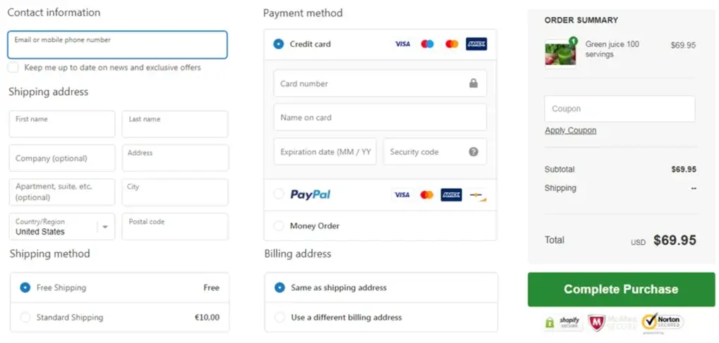
The first step in improving your e-commerce checkout process is to decrease the number of steps needed to complete a transaction. The more steps a consumer must take, the greater the chance of abandonment. Consider using a single-page checkout, which collects all relevant information on one page, or a clear progress indicator for multi-step processes. This not only speeds up the process but also decreases the intellectual strain on the customer, making it easier for them to complete the transaction.
A single-page checkout consolidates the entire process, including billing, shipping, and payment details, onto one page. This approach can significantly reduce the time it takes for customers to complete their purchase, which is particularly beneficial for mobile users. For businesses that prefer a multi-step process, it’s crucial to include a progress indicator that shows customers how many steps are left. This gives customers a sense of control and reduces anxiety about the length of the process.
Offer Guest Checkout Options
Forcing customers to create an account before making an order is one of the most effective strategies to increase cart abandonment. While having customer accounts is beneficial for businesses, it is essential to have a guest checkout option for people who prefer a faster, easier purchase procedure. Nobody wants to create an account, especially for a single purchase, so offering this option can significantly increase conversion rates.
Customers can make their purchases using guest checkout without having to create an account, enter a password, or fill out additional forms. This is especially helpful for new customers who may not trust your website enough to register an account. You can, however, encourage the creation of accounts by providing incentives such as discounts or faster checkouts for future purchases after the initial transaction is complete.
Enable Autofill and Predictive Text
To further streamline the e-commerce checkout process, it’s essential to enable autofill and predictive text features. These tools can automatically fill in shipping and payment details, reducing the time and effort required to complete the checkout. This is particularly important for mobile users, who may find it cumbersome to enter information manually on a small screen.
Autofill features can be implemented for various fields, such as addresses, payment information, and contact details. By using browser-stored information or third-party tools like Google Autofill, you can significantly reduce the number of steps required to complete the checkout. Additionally, predictive text can assist customers by suggesting options as they type, making the process even quicker and more intuitive.
Maintain Transparency
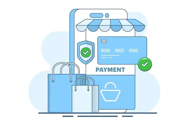
Giving clients accurate, truthful, and transparent information is essential to maintaining transparency. This includes product specifics, return procedures, delivery charges, and up-front prices. Transparency increases customer pleasure, clears up confusion, and fosters trust, resulting in better engagement and enduring loyalty.
Display Clear Pricing Information
Transparency is essential for developing confidence with your clients, particularly when it comes to price. Ensure that all expenses are clearly listed on the e-commerce checkout page, so that buyers understand exactly what they are paying for. This includes listing product prices, taxes, shipping costs, and any available discounts. By offering a comprehensive breakdown of expenses, you may avoid unpleasant surprises that may result in cart abandonment.
Displaying accurate pricing information helps clients comprehend the overall cost of their product before they go to the payment step. This is especially significant for overseas buyers, who may face additional taxes or shipping costs. It’s also important to include any applicable discounts or coupon codes early in the checkout process so that clients can see the savings they’re getting.
Provide a Summary Before Finalizing Purchase
Before customers finalize their purchase, it’s important to provide a comprehensive summary of their order. This summary should include product details, quantities, prices, shipping information, and the total cost. Allow customers to review and confirm their order before proceeding to payment. This step not only helps prevent mistakes but also gives customers one last opportunity to ensure everything is correct.
The order summary should be prominently displayed and easy to read. It should include all relevant information, such as product images, names, sizes, colors, and prices. Additionally, provide options for customers to edit their order, such as changing quantities, removing items, or updating shipping details. This level of transparency and control can help build trust and reduce the likelihood of returns or complaints.
No Hidden Costs
One of the most common reasons for cart abandonment is the discovery of hidden costs during the checkout process. These can include unexpected shipping fees, taxes, or handling charges. To avoid this, it’s essential to be upfront about all costs from the beginning. Clearly display all charges on the e-commerce checkout page and avoid adding any unexpected fees during the final stages of checkout.
Hidden costs can create a sense of mistrust and frustration, leading customers to abandon their cart and look for alternative options. To prevent this, ensure that all costs are transparently communicated throughout the checkout process. Consider offering a shipping calculator or tax estimator early in the checkout process, so customers know exactly what to expect before they reach the payment stage.
Enhance Usability and Accessibility
Improving usability and accessibility entails making a program or website user-friendly and accessible to all users, including those with disabilities. This includes WCAG compliance, mobile responsiveness, simple navigation, quick loading times, and an intuitive design. A user-friendly interface boosts conversions, decreases annoyance, and enhances engagement.
Optimize for Mobile Devices
With the increasing number of mobile shoppers, optimizing the e-commerce checkout page design for mobile devices is no longer optional—it’s a necessity. Ensure that your checkout page is fully responsive, meaning it adjusts seamlessly to different screen sizes and devices. A mobile-friendly checkout process can significantly improve the user experience and reduce cart abandonment rates among mobile users.
Responsive design ensures that your checkout page is easy to navigate, regardless of the device being used. This includes optimizing button sizes, form fields, and text for smaller screens. Additionally, consider implementing mobile-specific features, such as touch-friendly navigation, simplified forms, and mobile payment options like Apple Pay or Google Wallet. By catering to the needs of mobile users, you can enhance the overall usability of your checkout process.
Easy Navigation and Intuitive Design
The design of your e-commerce checkout page should be intuitive and easy to navigate. This means using clear buttons, readable fonts, and a logical flow that guides customers through the checkout process. Avoid cluttering the page with unnecessary elements or distractions that could confuse or overwhelm customers. The goal is to create a straightforward, user-friendly experience that makes it easy for customers to complete their purchase.
Intuitive design also involves using consistent terminology and design elements throughout the checkout process. For example, use the same button styles, colors, and icons across all pages to create a cohesive experience. Additionally, ensure that the checkout process follows a logical sequence, with each step leading naturally to the next. This can help reduce friction and make the process feel smoother and more predictable.
Ensure Accessibility Compliance
Accessibility is an important consideration in the e-commerce checkout page design. By following accessibility guidelines, such as the Web Content Accessibility Guidelines (WCAG), you can ensure that your checkout page is usable by all customers, including those with disabilities. This includes providing alternative text for images, using descriptive link text, and ensuring that form fields are labeled correctly.
Accessible design benefits all users, not just those with disabilities. For example, clear and descriptive labels can help all customers understand what information is required in each form field. Additionally, providing keyboard navigation options can make the checkout process easier for customers who prefer not to use a mouse. By prioritizing accessibility, you can create a more inclusive shopping experience and reach a wider audience.
Build Trust with Security Features
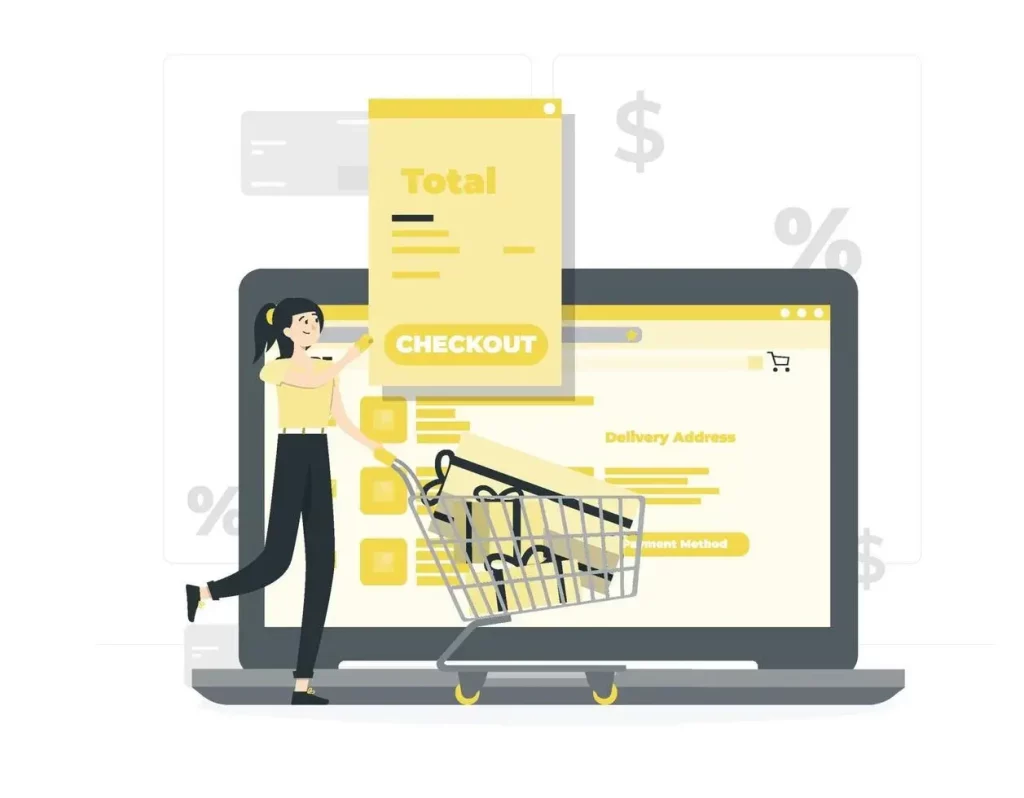
Security is a primary issue for online buyers, particularly throughout the checkout process. To increase confidence, prominently show safety certificates and badges on your e-commerce checkout page. This includes SSL certificates, PCI compliance badges, and any other essential security certifications. These signs of confidence reassure clients that their personal and financial information are secure.
Security seals and badges should be prominently placed, such as near the method of payment or checkout button. Consider giving a brief description of what each seal or badge means, so buyers know what level of security they are getting. An SSL certificate, for example, guarantees that data is protected during transmission, whilst PCI compliance demonstrates that your company adheres to industry standards when dealing with payment information.
Provide Multiple Payment Options
Offering a variety of payment options is another way to build trust and improve the overall checkout experience. Customers have different preferences when it comes to payment methods, so it’s important to provide a range of options, including credit and debit cards, PayPal, digital wallets, and even buy-now-pay-later services. The more payment options you offer, the more likely customers are to complete their purchase.
In addition to traditional payment methods, consider offering express checkout options, such as one-click purchasing with stored payment information. This can be particularly appealing to repeat customers who want to complete their purchase quickly and efficiently. By providing multiple payment options, you can accommodate the diverse needs of your customers and reduce the likelihood of cart abandonment.
Clearly Communicate Privacy Policies
Offering a range of payment methods is another way to encourage confidence and enhance the whole checkout experience. Customers have varied payment method preferences, so it’s necessary to offer a variety of options, such as credit and debit cards, PayPal, digital wallets, as well as buy-now-pay-later options. The more payment choices you provide, the more likely clients are to finish their transaction.
In addition to typical payment methods, consider providing express checkout options, such as one-click purchasing using stored payment details. This may be especially tempting to recurring consumers who wish to complete their purchase fast and efficiently. By offering numerous payment alternatives, you can meet your customers’ diverse demands and lessen the probability of cart abandonment.
Optimize Load Times and Performance
Optimizing load times and performance entails ensuring a website loads quickly and fluidly through caching, picture compression, code reduction, and a content delivery network. Faster websites, especially on mobile devices, increase conversions, lower bounce rates, and enhance user experience.
Reduce Page Load Time
Page load time is a critical factor in the success of your e-commerce checkout page design. Slow load times can lead to frustration and increased cart abandonment, especially on mobile devices. To optimize load times, consider techniques such as compressing images, using a content delivery network (CDN), and minimizing the use of third-party scripts. These strategies can help ensure that your checkout page loads quickly and efficiently.
In addition to optimizing the checkout page itself, consider the impact of other elements on your site, such as large images, videos, or animations. These elements can slow down the overall performance of your site, leading to longer load times on the checkout page. By optimizing all elements of your site for speed, you can create a smoother, more seamless checkout experience for your customers.
Test for Performance Issues
Regular testing is required to identify and resolve performance issues on your online store’s checkout page. This includes checking for defects, broken links, and slow-loading items. Use performance monitoring tools to track the speed and dependability of your checkout page, and perform regular reviews to ensure all functionality is working properly.
Screening should be done on a variety of devices, browsers, and operating systems to ensure that the checkout procedure is consistent and reliable for all users. Consider running user tests to get feedback on the whole checkout experience. This will assist you uncover any pain points or areas for development that may not be obvious based only on performance data.
Ensure Server Reliability
Server reliability is another critical factor in the performance of your e-commerce checkout page. If your server goes down or experiences slow response times, customers may be unable to complete their purchase, leading to lost sales and a negative customer experience. To ensure server reliability, invest in a high-quality hosting solution and consider implementing server redundancy or load balancing to handle traffic spikes.
In addition to server reliability, consider the impact of other factors, such as network latency, on the performance of your checkout page. By optimizing your server infrastructure and minimizing latency, you can create a faster, more reliable checkout experience for your customers.
Implement Effective Call-to-Action (CTA) Buttons
Call-to-action (CTA) buttons are a critical element of your e-commerce checkout page design. These buttons guide customers through the checkout process and encourage them to complete their purchase. To create effective CTAs, use contrasting colors, clear text, and strategic placement to draw attention to the most important actions. For example, the “Complete Purchase” button should be prominently displayed and easy to find.
In addition to using contrasting colors, consider the size and shape of your CTA buttons. Larger buttons with rounded edges are often more visually appealing and easier to click, especially on mobile devices. Additionally, use clear, action-oriented text that tells customers exactly what will happen when they click the button. For example, “Complete Purchase” or “Place Order Now” are clear and direct, encouraging customers to take the final step in the checkout process.
Encourage Immediate Action
Creating a sense of urgency can be a powerful motivator for encouraging customers to complete their purchase. Consider using phrases like “Complete Purchase” or “Place Order Now” to create a sense of immediacy. Additionally, consider implementing countdown timers or limited-time offers on the e-commerce checkout page to further encourage immediate action.
Urgency can also be created through scarcity, such as displaying low stock levels or limited availability on the checkout page. This can prompt customers to complete their purchase quickly before the item sells out. However, it’s important to use urgency tactics sparingly and transparently, as overuse or misleading claims can erode trust and lead to negative customer experiences.
Avoid Distractions
The e-commerce checkout page should be focused on one goal: completing the purchase. To achieve this, minimize distractions by removing any unnecessary elements from the page. This includes sidebars, navigation menus, and promotional banners that could divert attention away from the checkout process. By keeping the page clean and uncluttered, you can help customers stay focused on completing their purchase.
In addition to minimizing distractions, consider using a clean, minimalist design that emphasizes the most important elements of the checkout process. For example, use plenty of white space to create a sense of clarity and focus, and ensure that the most important actions, such as entering payment information or clicking the “Complete Purchase” button, are prominently displayed.
Personalization and Customization
Personalization is a powerful tool for enhancing the customer experience on the e-commerce checkout page. Consider offering personalization options, such as saving payment details for future purchases, choosing preferred delivery options, or applying discounts automatically based on customer preferences. These options can make the checkout process more convenient and tailored to each customer’s needs.
Personalization can also be used to create a more seamless checkout experience for returning customers. For example, you can offer one-click purchasing options that use stored payment and shipping information, allowing customers to complete their purchase with minimal effort. Additionally, consider using personalized recommendations to cross-sell or upsell related products during the checkout process.
Display Personalized Recommendations
Cross-selling and upselling are effective strategies for increasing average order value on the e-commerce checkout page. By displaying personalized recommendations based on the customer’s cart items, you can encourage customers to add more products to their order before completing their purchase. These recommendations should be relevant and timely, enhancing the overall shopping experience without feeling intrusive.
Personalized recommendations can be displayed in various locations throughout the checkout process, such as on the order summary page or near the “Complete Purchase” button. Additionally, consider offering bundle deals or discounts on related products to further incentivize customers to add more items to their cart. By using personalized recommendations effectively, you can increase sales and enhance the overall value of each transaction.
Monitor and Analyze Checkout Performance
Monitoring and analyzing the performance of your e-commerce checkout page is essential for identifying areas for improvement and optimizing the overall checkout experience. Use analytics tools to track key metrics such as cart abandonment rate, conversion rate, and checkout duration. These metrics can provide valuable insights into how customers are interacting with your checkout page and where they may be encountering issues.
Analytics tools can also help you identify patterns and trends in customer behavior, such as which steps in the checkout process are most likely to lead to abandonment. By analyzing this data, you can make informed decisions about where to focus your optimization efforts. Additionally, consider using heatmaps or session recordings to gain a deeper understanding of how customers are navigating the checkout process.
Conduct A/B Testing
A/B testing is a powerful tool for optimizing the e-commerce checkout page design. By testing different versions of your checkout page, you can identify which design elements, layouts, or features are most effective at improving conversion rates. For example, you can test different button colors, form layouts, or messaging to see which version performs better.
A/B testing should be an ongoing process, with regular tests conducted to continuously optimize the checkout experience. It’s important to test one variable at a time to accurately measure the impact of each change. Additionally, consider testing different versions of your checkout page for different segments of your audience, such as mobile users or international customers, to ensure that the checkout process is optimized for all users.
Gather User Feedback
In addition to using analytics tools and A/B testing, gathering direct feedback from customers is a valuable way to identify areas for improvement on the e-commerce checkout page. Consider conducting post-purchase surveys or feedback forms to ask customers about their experience during the checkout process. This feedback can provide valuable insights into what is working well and where there may be room for improvement.
User feedback can also help you identify pain points or frustrations that may not be immediately apparent from analytics data alone. For example, customers may provide feedback about specific form fields that are confusing or difficult to complete. By gathering and acting on user feedback, you can continuously improve the checkout experience and enhance overall customer satisfaction.
Provide Support and Assistance
Providing support and assistance during the checkout process is essential for reducing cart abandonment and improving customer satisfaction. Consider including live chat or help options on the e-commerce checkout page to give customers quick access to support if they encounter any issues or have questions. This can help prevent frustration and ensure that customers are able to complete their purchase smoothly.
Live chat is particularly effective for providing real-time assistance, allowing customers to get immediate answers to their questions without leaving the checkout page. Additionally, consider offering help options such as FAQs or contact forms for customers who prefer to seek support through other channels. By making support readily available, you can enhance the overall checkout experience and reduce the likelihood of cart abandonment.
Make Contact Information Readily Available
In addition to providing support options like live chat and FAQs, it’s important to make your contact information readily available on the e-commerce checkout page. This includes listing phone numbers, email addresses, or other contact options where customers can reach you if they need assistance. Providing multiple contact options gives customers the flexibility to choose the method that works best for them.
Contact information should be prominently displayed and easy to find, so customers don’t have to search for it if they need help. Additionally, consider offering extended customer support hours, especially during peak shopping periods, to ensure that customers can get the assistance they need when they need it. By making it easy for customers to contact you, you can enhance the overall checkout experience and build trust with your customers.
Conclusion
A well-designed e-commerce checkout page is essential for maximizing conversion rates, reducing cart abandonment, and enhancing overall customer satisfaction. By following the fundamental guidelines outlined in this blog, e-commerce businesses can create a streamlined, user-friendly checkout process that meets the needs and expectations of modern online shoppers. From simplifying the checkout process to building trust with security features, each guideline plays a crucial role in optimizing the checkout experience.
Implementing these guidelines is not a one-time task, but an ongoing process of monitoring, testing, and optimizing. E-commerce businesses should regularly review their checkout page, gather feedback, and make improvements based on data and user insights. By staying proactive and continuously optimizing the checkout process, businesses can create a seamless, efficient, and enjoyable shopping experience that drives sales and fosters customer loyalty.
Encourage your team to prioritize the e-commerce checkout process as a key area of focus in your overall e-commerce strategy. Whether you’re implementing an express checkout for ecommerce or a more detailed multi-step process, these guidelines will help you create a checkout experience that not only meets but exceeds customer expectations.
FAQs
What is the B2B checkout process?
When customers click the Checkout button from the Cart page or are prompted to start the checkout procedure after placing a new purchase from their cart history, the B2B Checkout and Purchase Process begins. The Payment Type page appears if clients are already logged in.
Why do customers abandon their cart during checkout?
The Baymard Institute found that many customers leave their trolleys empty because they are either just perusing or not yet ready to make a purchase. Aside from this, additional expenses like shipping, taxes, or other fees force customers to abandon their carts.
